Improved Ribbons
With the now familiar Ribbon menus, Microsoft started to refine how they worked and looked. However, back came the FILE button (hooray), because the Office disc of 2007 just confused users - and they let Microsoft know about it! The Ribbon contains all your usual tabs but clicking the File button (blue for Word, green for Excel, orange for PowerPoint) now takes you to Backstage View.
Here we can see instantly information about the file and its properties (Meta Data), check its compatibility with older versions, and add protection. Office came of age with 2010, giving even more reasons for companies to roll out and upgrade for their users.

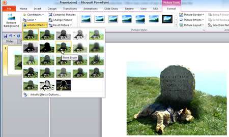
Artistic Effects
This feature allows the user to quickly take a photo or image and use some pretty advanced controls to make it look very good indeed. Photos were always handled pretty basically in earlier versions meaning you had to use a third party applications like Paint Shop or Gimp to edit photos. Now, right in the application such as PowerPoint or Word you can add an effect like Paint Brush or Pencil Sketch:

Protected View Mode
One of the great new features in Office 2010 was the ability to open documents in Protected Mode. This was due to the increased overall security in the applications so an email with an attached Word document would be set to open in Protected View, and no changes were allowed to the document unless this is authorised by the user.
Security is a key, and sometimes under-rated, feature in Office 2010, and the chances of opening up a maliciously infected file have ben drastically reduced.
Excel Sparklines & Slicers
Excel has come on leaps and bounds, from 2007 onwards we have now a huge capacity for data in a worksheet, over 16,000 columns and over 1 million rows. That's a lot of data. Dealing with large amounts of data is a daily task for a lot of users and the huge advances made by Office 2007 were built on in 2010. In particular, Excel 2010's Sparklines was a new feature that plotted little graphs next to your data right in the cells:

Slicers also arrived for Pivot Tables to allow further detailed colour coded filtering pop-ups for your data - this was powerful stuff indeed.
Let's Screenshot
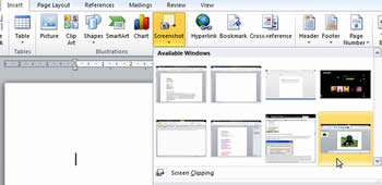
With Office 2007, taking screenshots required the use of the Windows utility or a third party application. Office 2010 made this easy, as applications have a built in facility to grab screen images as needed.
Screen Clip lets you stretch a window over the required data and it can be sent to your document. This is a really useful feature when you are creating manuals or - as we have found - training materials! Here we see the facility in Word 2010 so it's just a case of using it to grab images from your PC:

Our Verdict
There weren't a huge number of new features, but Office 2010 was a polished version of Office 2007. Features have been honed and bug fixed to create a very solid platform for most users.
Office products continue to be more compatible with each other, and using them is so much easier than older versions.
A more graphical feel to Word and PowerPoint is obvious and Excel even has improved Charts and data reporting capabilities via Pivot tables.
It's going to be difficult to improve on this, but we are sure that Microsoft has plenty of ideas. Let's see what happens next.

